
All the new graphs are great!
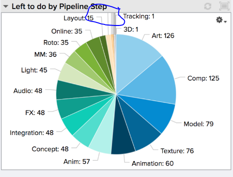
I've noticed with the pie charts however, sometimes the labels for some sections of the data go "too high" so they are outside the visible graph box and get cut off.
You can actually even see it in the sample images used in the Shotgun charts tutorial.
This can sometimes be fixed by adjusting the display order so labels are placed in different positions-- but I was wondering if this is something you have noticed / plan on fixing?