
Hey Shotgun,
I'm currently in a rut trying to finish some reporting I've been working on because I can't seem to get all of the text readable in the same picture when using the pie chart feature of the Production Insights graph widget.
I'm attaching the graph with the browser zoomed at both 67% and 125%.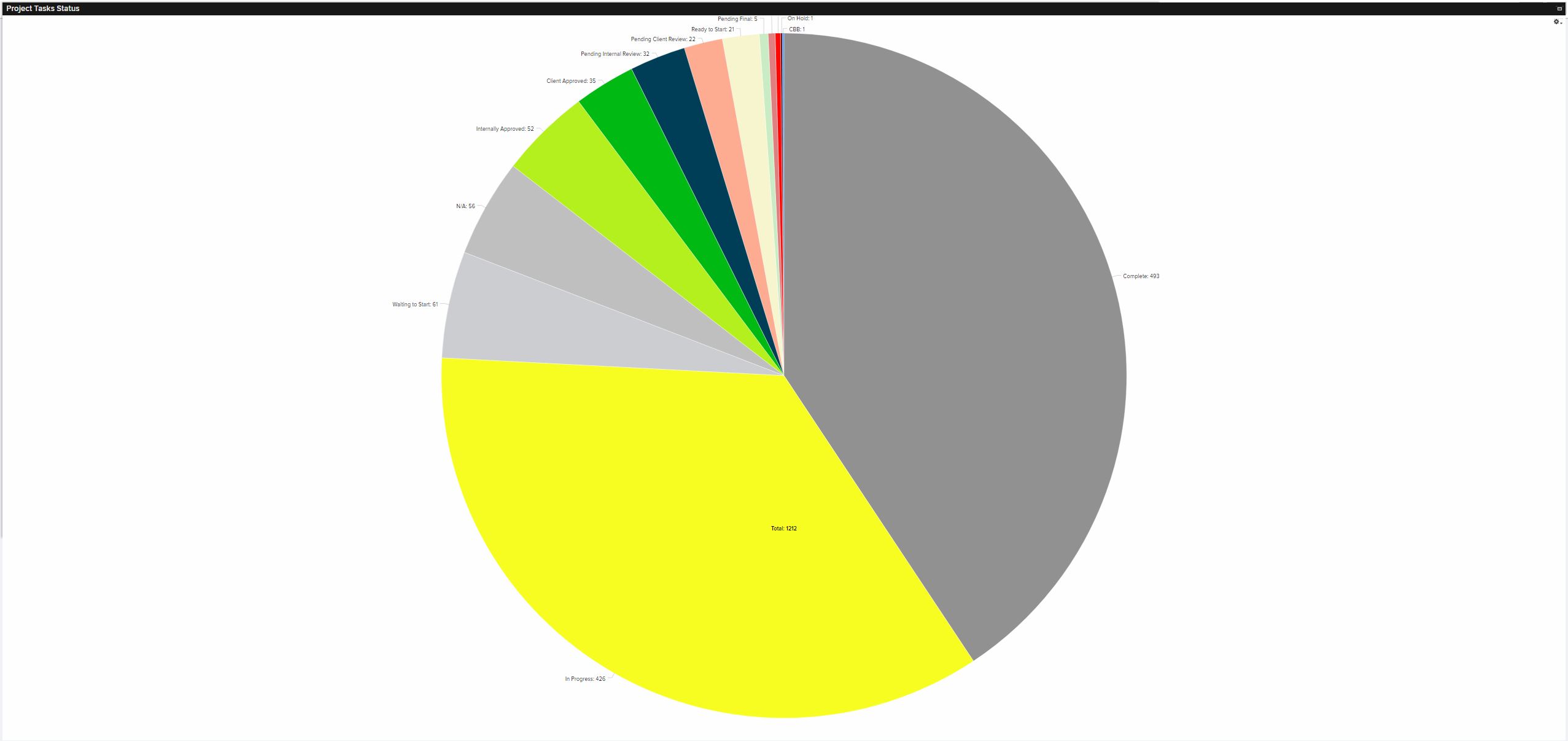
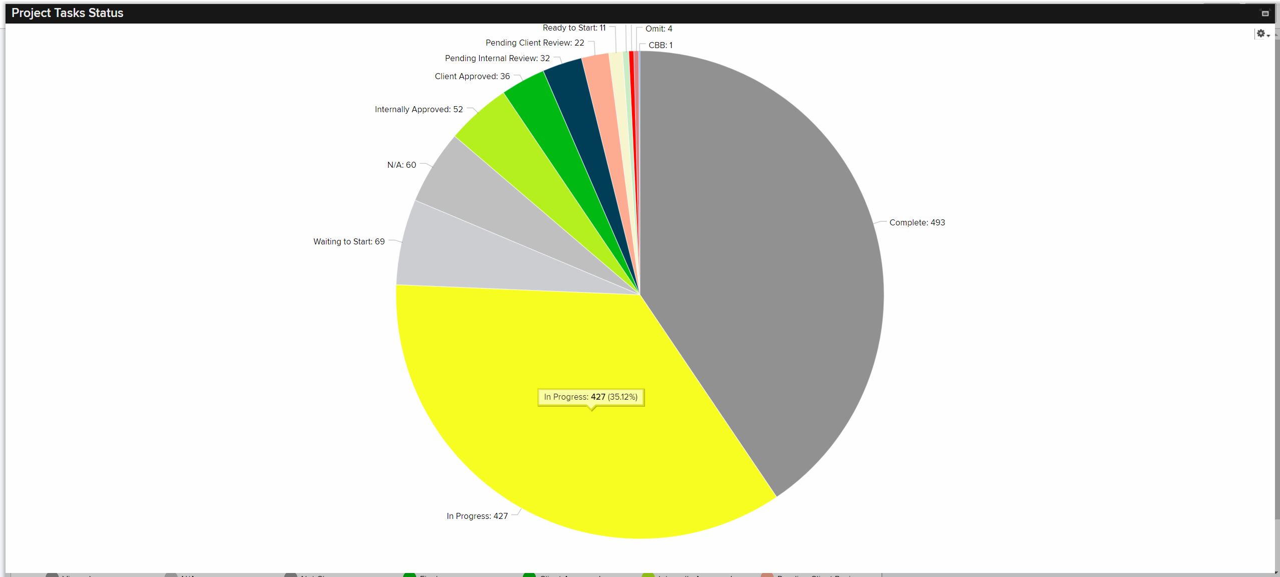
This looks to be because the size of the chart is set to scale automatically, so would it possible to have control over this feature so that we could have a different ratio of pie chart diameter to window size? Or at least be able to rotate the pie somehow so that most of the labels could be on the side? Any type of further control over this would be very helpful so that all of the labels can be seen for visual reporting!
Thanks!
-Jeremy